Bilingual Typography for Hong Kong
Where Chinese and Latin Scripts Meet with Intention
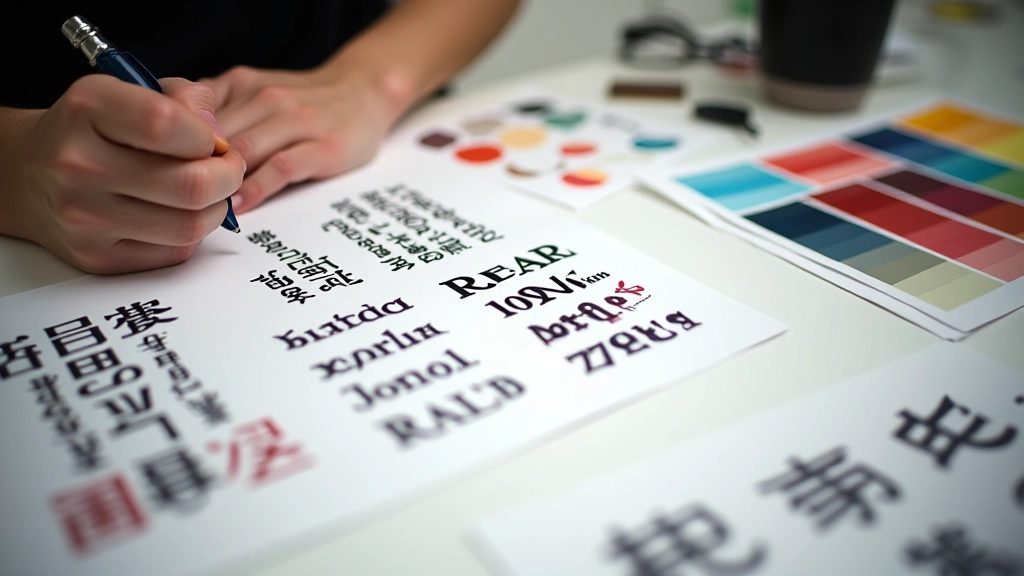
TypeSync Hong Kong Limited specializes in creating harmonious typeface combinations that bridge Traditional Chinese and English scripts. We’re focused on solving the unique challenges of bilingual design — from mixed-script spacing to elegant multilingual headers that work across all devices.

Understanding the Challenge
Hong Kong’s bilingual nature creates a design problem that’s rarely discussed. It’s not just translating English to Chinese. It’s making both scripts feel native, balanced, and readable on the same page.
The Script Mismatch Problem
English and Traditional Chinese have fundamentally different proportions, stroke weights, and optical centers. We’ve spent years analyzing how these systems interact — because standard web practices don’t account for bilingual composition. Most designers pick fonts independently. We pair them intentionally.
Line Height and Spacing Complexity
You can’t use the same line-height value for both scripts. Chinese characters are denser, wider, and occupy more vertical space. Mixed-script paragraphs need careful character spacing adjustments. We’ve developed frameworks that handle this automatically — so your text breathes properly whether it’s purely English, purely Chinese, or genuinely bilingual.
Cross-Browser Consistency
Traditional Chinese web fonts render differently across browsers, devices, and operating systems. We don’t just recommend fonts — we test them. Every pairing we suggest has been validated on Windows, macOS, iOS, and Android to ensure your design actually looks like you intended it to.
Our Core Specializations
TypeSync Hong Kong Limited brings together technical knowledge, design sensibility, and practical experience. Here’s what we’ve built expertise in over years of working with Hong Kong websites and international brands.
Font Pairing Strategy
We select typeface combinations where the English font complements the Chinese character structure. Not every font works with every Chinese typeface. We’ve tested hundreds of pairings.
Mixed-Script Spacing
Managing character spacing, word spacing, and line height when both scripts appear together. We create CSS frameworks that automatically adjust spacing based on script detection.
Multilingual Headers
Headers need to look elegant in both languages. We design systems where Chinese and English headers maintain visual hierarchy and proportional balance.
Local + International Audiences
Hong Kong websites serve both local and international visitors. We ensure typography works for traditional Chinese readers while remaining professional for English-speaking users.
Readability Testing
We test every recommendation across devices, browsers, and connection speeds. A font might look beautiful in design tools but fail on real devices. We validate everything.
Web Font Implementation
Font loading strategy, fallback chains, variable font optimization. We handle the technical side so your bilingual typography performs as well as it looks.
Our Process
We don’t believe in one-size-fits-all typography solutions. Every Hong Kong website is different. Here’s how we develop bilingual typography systems that actually work for your specific needs.
Audit Your Current System
We analyze your existing typography — font choices, spacing, hierarchy, and how Chinese and English interact. We’re looking for pain points. Maybe your Chinese headers feel cramped. Maybe the mixed-script body text has awkward line breaks. Maybe different devices render fonts differently.
Research and Test Pairings
We test candidate font combinations across your actual content. Not placeholder text — your real Chinese descriptions, English headlines, mixed paragraphs. We evaluate how characters sit next to each other, how line breaks work, how the system scales across device sizes.
Develop Spacing Framework
We build CSS that handles line-height, letter-spacing, and word-spacing intelligently. This isn’t manual adjustment on every paragraph. We’re creating systems. You’ll get documentation showing exactly how spacing changes based on script type and context.
Validate Across Devices
We test everything. Windows machines with ClearType rendering. Macs with different font smoothing settings. iPhones with different iOS versions. Android tablets with various manufacturers’ font handling. We document rendering differences and adjust our recommendations accordingly.
Implement and Document
We provide the actual CSS, font files, and implementation strategy. Plus comprehensive documentation explaining why we made each choice. You’re not just getting fonts — you’re getting knowledge you can maintain and extend.
What Drives Us
TypeSync Hong Kong Limited exists because bilingual typography matters. It’s not decorative. It affects readability, user experience, and how professional your website feels to both Chinese and English readers.
Readability First
Every recommendation we make is validated for readability. Beautiful fonts that hurt to read aren’t actually beautiful. We optimize for comfort and clarity across all device sizes.
Cultural Balance
We don’t subordinate one script to another. Chinese isn’t “translated English” and English isn’t “secondary.” Both scripts deserve equal design attention and respect.
Evidence-Based
We test everything. Recommendations aren’t based on aesthetic preference or “best practices” from English-only design. They’re based on actual rendering across real browsers and devices.
“We weren’t happy with how our Chinese headlines looked next to English body text. Different typefaces, weird spacing, everything felt disconnected. After working with TypeSync Hong Kong Limited, it’s cohesive. Our Hong Kong visitors immediately notice the improvement — the site feels more thoughtfully designed.”
— Victoria Chen, Web Director, Hong Kong fintech company
Important Information
The information and recommendations provided by TypeSync Hong Kong Limited are for educational and informational purposes. While we test typography systems thoroughly across browsers and devices, rendering results may vary based on user system configurations, font availability, operating system updates, and browser implementations. We don’t guarantee identical visual output across all platforms — only that our recommendations have been tested and validated for readability and functionality. Typography design involves technical, aesthetic, and user-experience considerations. We encourage users to test all recommendations in their specific context before full deployment. Results may vary based on content type, audience demographics, and implementation details.