
Why Mixed-Script Spacing Matters
When you’re designing for Hong Kong audiences, you’re almost always dealing with both Traditional Chinese and English text on the same page. It’s not just about picking a font — it’s about understanding how these two completely different writing systems interact with each other.
Traditional Chinese characters are built on a square grid system. Each character takes up roughly the same amount of horizontal and vertical space. Latin letters, on the other hand, are proportional. An “i” takes up way less space than a “w”. This fundamental difference creates real problems when you try to combine them in a single line or paragraph.
Understanding Line Height Challenges
Here’s where it gets tricky. Line height — also called leading — works differently for Chinese text than it does for English. A typical body text in English uses a line-height ratio of around 1.5 to 1.6. This gives breathing room between lines and makes long paragraphs easier to read.
But when you apply that same ratio to Traditional Chinese text, something strange happens. The characters start to feel cramped. They need more vertical space because each character is visually denser. You’re not just dealing with ascenders and descenders like you do with Latin letters — you’ve got the entire height of the character to consider.
Most designers find that Chinese body text needs a line-height between 1.8 and 2.0 to feel properly spaced. But here’s the problem: if you’re mixing English and Chinese in the same paragraph, setting the line-height to 1.8 makes the English text look loose and airy. Too loose.
Note: These are guidelines based on common practice in Hong Kong web design. Actual values depend on your specific font choices, target audience, and content structure. Always test across multiple devices and get feedback from users who read both languages fluently.
Character Spacing Adjustments
Letter-spacing — the space between individual characters — is another challenge entirely. In English typography, we use letter-spacing pretty carefully. Too much and text becomes hard to read. Too little and it feels cramped.
Traditional Chinese typography traditionally doesn’t use much letter-spacing at all. The characters are already spaced evenly by their square grid structure. But when you drop English words into Chinese text, suddenly you’ve got inconsistency. An English word like “typography” sits in the middle of Chinese characters that all have equal spacing between them.
The practical solution? You need to add subtle letter-spacing to your Latin text when it’s embedded in Chinese sentences. We’re talking about 0.02em to 0.05em — tiny adjustments that make a huge difference. This brings the Latin text into visual harmony with the Chinese characters around it.
Set Base Line Height
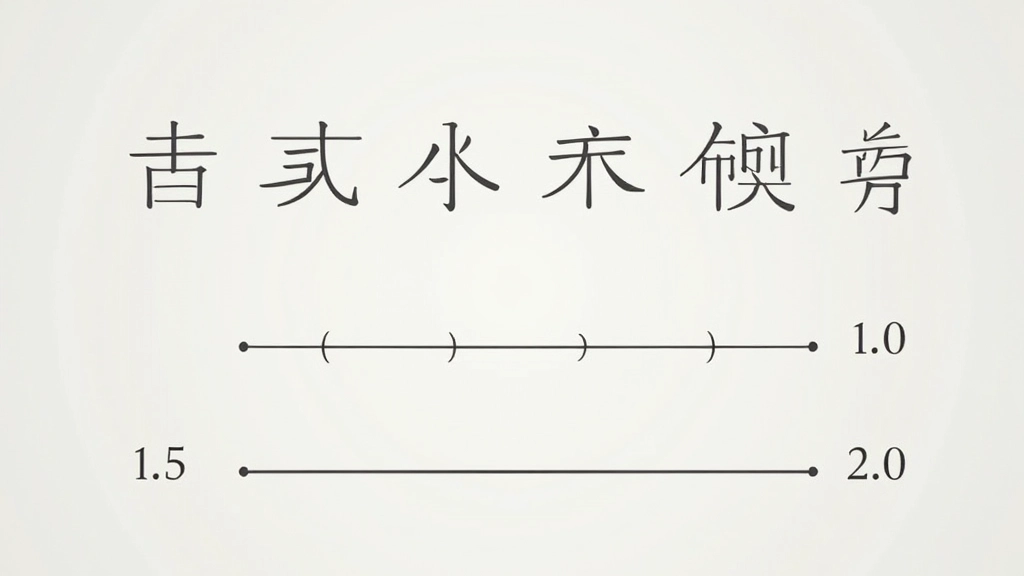
Start with 1.8 to 2.0 for Chinese body text, 1.5 to 1.6 for English-only sections.
Add Letter-Spacing to Latin Text
Apply 0.03em to English words inside Chinese paragraphs for consistency.
Test Across Browsers
Different browsers render text differently. Check on Chrome, Safari, and Firefox across devices.
Refine with Real Content
Use actual content from your site. Numbers and measurements change with real text.
Practical Implementation
Let’s talk about how you actually make these adjustments in CSS. It’s simpler than you might think, but it requires some planning.
The most effective approach is to set your base line-height on the body element, then adjust it for specific content blocks. For a Hong Kong site mixing Chinese and English, you might set the base to 1.8, which works reasonably well for Chinese. Then for English-heavy sections — like testimonials or footer text — you can drop it back to 1.5.
For character spacing, you’ve got a few options. You can wrap English phrases in a span element and apply letter-spacing specifically to those. Or you can use CSS to target certain patterns. Neither approach is perfect, but they work when you’re consistent about it.

Testing and Refinement
Here’s what you really need to know: these aren’t set-it-and-forget-it settings. Different fonts behave differently. A font like “思源黑體” (Source Han Sans) might look perfect at line-height 1.85, while “微軟雅黑” (Microsoft YaHei) might need 1.95.
You’ve got to test. Load your page on real devices — not just your desktop monitor. Check how it looks on a phone in bright sunlight. That’s where you’ll spot problems you missed in the office. And get feedback from actual Hong Kong users. They’ll notice things you won’t.
The best practice? Create a style guide document that shows your exact spacing values, then stick to it across your entire site. Document why you chose 1.87 instead of 1.9. That kind of detail matters when you’re handing off work to other designers or developers.
The difference between “good enough” and “professional” in bilingual typography often comes down to line height. It’s the invisible element that makes text either feel right or feel slightly off.
Key Takeaways
- Traditional Chinese text needs line-height between 1.8–2.0 for proper spacing. English text typically uses 1.5–1.6.
- When mixing both scripts in one paragraph, you’re making a compromise. Plan your layouts accordingly.
- Add subtle letter-spacing (0.03em) to English words within Chinese text for visual consistency.
- Test across different fonts, browsers, and devices. What works for one font might not work for another.
- Document your choices and maintain consistency across your entire site. This matters for both usability and maintainability.