When you’re designing for Hong Kong, Singapore, or any bilingual market, you’re juggling two completely different writing systems. Traditional Chinese characters and Latin letters don’t just look different — they’re built on fundamentally different principles. Get this pairing wrong and your website feels disjointed. Get it right and it becomes something memorable.
The challenge isn’t just finding two fonts that look nice together. It’s understanding how Chinese characters are constructed, what makes them readable on screen, and then matching that with a Latin typeface that complements without competing. We’ve spent years refining this approach for clients across Asia, and it’s time to break down exactly what works.
The Structure of Traditional Chinese Characters
Traditional Chinese characters are built differently than anything in the Latin alphabet. Each character — whether it’s a simple one like 中 or a complex one like 驫 — occupies a square grid. That’s not just aesthetic. It’s foundational to how they work.
Latin letters are based on an invisible baseline. They have ascenders that go up (like the top of “h”) and descenders that go down (like the tail of “g”). Chinese characters don’t have this. They sit within a uniform square, which means they’re naturally more compact vertically. This matters hugely when you’re setting body copy. If you don’t account for it, your mixed-script text will feel unbalanced.
Weight distribution is another critical difference. A Chinese character like 黑 uses strokes that vary in thickness — thin diagonal strokes, thick vertical ones. This creates rhythm and legibility. Latin typefaces do this too, but the proportions are completely different. A stroke in a Chinese font might be 20-30% of the character width. In Latin, it’s often closer to 15-20%. These percentages determine how “bold” or “light” the overall page feels.
Key Point: Chinese characters occupy a square grid; Latin letters use a baseline system. This fundamental difference means you can’t just pick any two fonts and expect them to work together.

Why Weight Matching is Everything
Here’s where most people go wrong. They’ll pick a beautiful serif font for Chinese text, then choose a sleek sans-serif Latin font because they like how it looks. The result? One part of your site feels heavy and traditional, the other feels modern and light. They’re fighting each other.
Weight harmony means the visual density of the Chinese and Latin text should feel equivalent. A Medium-weight Chinese typeface should pair with a Medium-weight Latin typeface, not a Light one. We’re not talking about exact pixel measurements — it’s about visual perception. Your eye should feel the same “pressure” reading both scripts.
The practical approach? Set your Chinese text at your preferred size and weight. Then adjust your Latin text — usually making it slightly heavier than you normally would. Most Latin typefaces look lighter than they actually are when mixed with Chinese because of how the character grids work differently. A Regular Latin font might need to be Medium or even Semi-bold to match a Regular Chinese font.
Selecting Harmonious Typeface Pairs
What makes two fonts “harmonious”? It’s not about matching historical origins or design movements. It’s about visual compatibility at three levels: proportions, spacing, and character emphasis.
Start with proportion. If your Chinese font has a traditional style with long vertical strokes and minimal serifs, pair it with a Latin typeface that also respects vertical emphasis. A font like Garamond has strong vertical stress; it’ll work better than Optima, which has more even stroke weight. The vertical movement in both creates cohesion.
Then consider spacing. Chinese fonts tend to be more condensed in their natural spacing — characters sit closer together because they’re grid-based. Your Latin typeface shouldn’t fight this. If you use a very open, airy Latin font, you’ll need to adjust letter-spacing to compensate. Most designers find that adding 0.5-1px of letter-spacing to the Latin text helps it sit more naturally alongside Chinese.
Character emphasis — how thick the thick strokes are versus the thin ones — creates the personality. If your Chinese font has high contrast between thick and thin strokes, your Latin font should too. Pair a high-contrast Chinese font with a modern geometric sans-serif and you’ve got trouble. Instead, use a transitional serif or a sans-serif with clear stroke variation.
Practical Steps for Choosing Your Pair
Determine Your Chinese Font First
Don’t start with Latin. Choose your Chinese typeface based on your brand personality and readability needs. Will you use a traditional serif style or a modern sans-serif? This decision drives everything else.
Analyze Weight and Proportion
Look at your chosen Chinese font. Is it bold or light? Are characters condensed or expanded? Are vertical strokes emphasized? Write these observations down — they’re your matching criteria.
Test with Real Text Samples
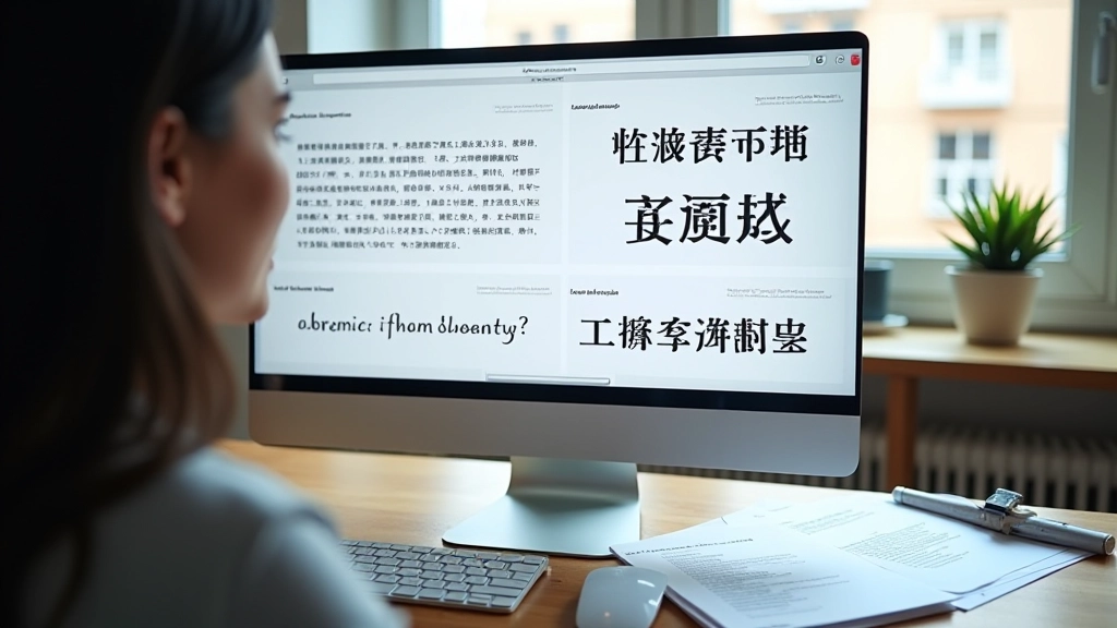
Create a test layout with actual body copy — at least 100 words of Chinese and 100 words of English. View it at actual reading sizes (14-16px on screen). Theoretical matching doesn’t always translate to real-world readability.
Adjust Letter-Spacing and Line Height
Once you’ve selected both fonts, you’re not done. Adjust spacing. Typically add 0.5-1px letter-spacing to Latin text. Increase line-height to at least 1.6 for mixed-script paragraphs to ensure readability.
Disclaimer: This article provides educational information about typography principles and font selection practices. While we’ve shared approaches that work well for bilingual design, individual results depend on specific contexts, audience preferences, and technical implementation. Always test your font choices with real users and actual content. Font rendering varies across browsers, operating systems, and devices. We recommend consulting with experienced typography specialists for critical brand projects.

Beyond the Basics: Fine-Tuning for Impact
You’ve selected your fonts and adjusted spacing. Now comes the refinement. Many designers stop here, but the best bilingual websites go further. Consider scale relationships. Chinese characters naturally read at slightly smaller sizes than Latin text because of their density. A 16px Chinese headline might pair better with an 18px Latin headline rather than matching sizes exactly. This accounts for the perceptual difference in character density.
Line length matters too. Chinese text can handle longer line lengths than Latin text — up to 70-80 characters. Latin text gets harder to read past 65 characters. When you’re mixing both on a page, you’ll need to make a compromise. Usually 55-65 characters works for both, but test this with your actual audience.
One more thing: don’t neglect the small sizes. Headlines and body copy look great together, but what about labels, captions, and metadata? These need testing too. A font pair that sings at 16px body size might struggle at 12px. Always test across the full range of sizes you’ll actually use.
Making It All Work Together
Bilingual typography isn’t a compromise between two systems — it’s an integration of two complete design languages. When you understand how Chinese characters are constructed and how they differ from Latin letters, you stop trying to force a perfect match. Instead, you create harmony through informed choices.
Start with weight matching. Get your spacing right. Test with real content at real sizes. Adjust proportions if needed. This process takes time, but it’s the only way to create websites that feel genuinely unified to both Cantonese and English readers. Your Hong Kong audience deserves a design that respects both parts of their linguistic reality, and that respect shows in the details.
The next time you’re facing a bilingual project, you’ll know exactly where to start and what to watch for. Your font choices won’t feel like compromises anymore. They’ll feel intentional.